Introduction:
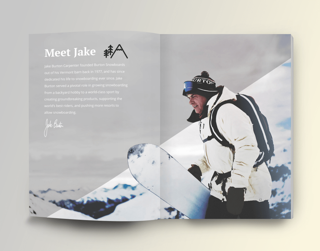
The purpose of this post is to go over the elements of type and photography used in the photo above. The photo used was designed by Hey Mitch Hey Design, which is a design and illustration company. They created this magazine spread for Burtons Snowboard and Winter Apparel Company in 2019. Now that you know, Let’s get started!
Type Face:
This magazine uses old style, san serif, and script. The old style font is used for the title and can be identified for its use of serifs and thick to thin transition is slight. The san serif type was used in the body copy and is recognized by its lack of serifs and a similar thickness all around. Script is used at the end and is identified by its fluid stroke that varies from thick to thin and often looks like handwriting.
Two Contrasting Type Faces:
The title and the body contrast each other in size. The body copy is smaller than the title. The type also differs in weight with the title having thicker strokes and the body copy using thinner strokes but still using the same thickness all around.
Photography Rules:
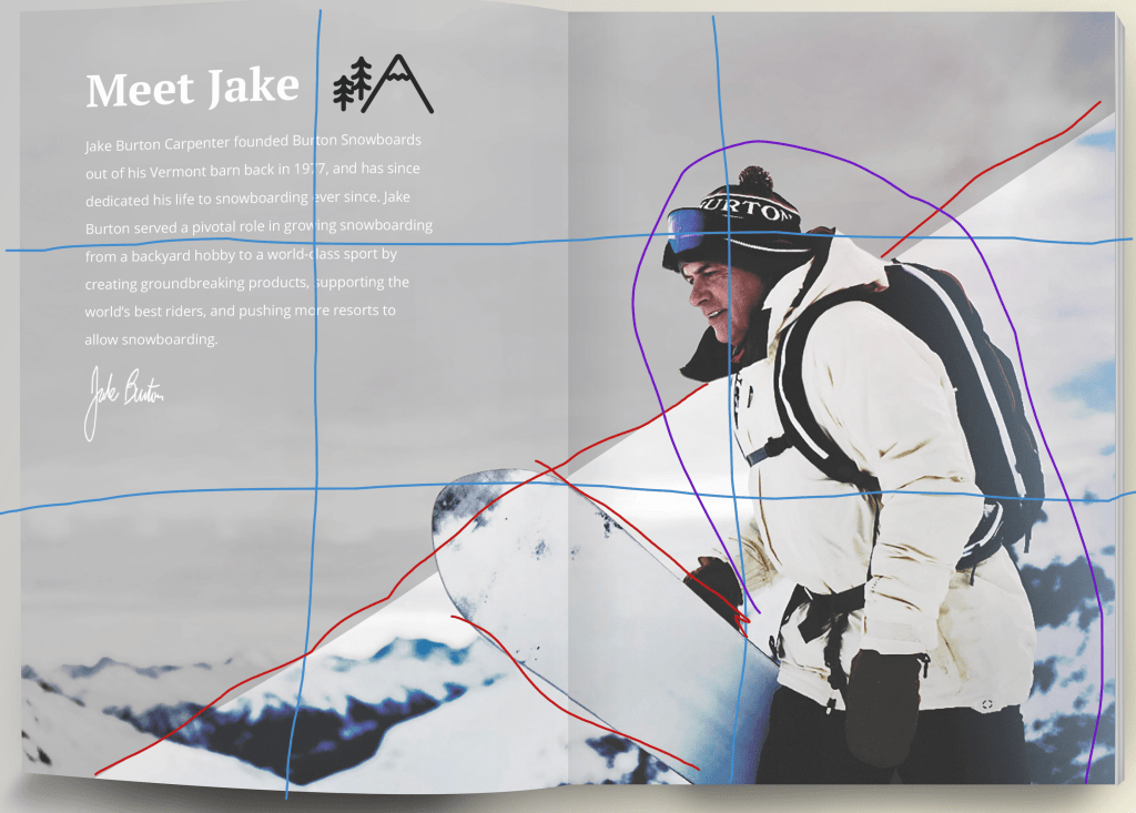
In this photo they follow the rule of thirds by having the subject’s face on the line to the far right. They also have the line of the mountain going towards the subjects face. I would say the snow board looks like it’s going in the opposite direction so it doesn’t really follow it. This picture follows the shallow depth of field as well since the background is fuzzy and the subject is very clear.
Mimicked Photos:
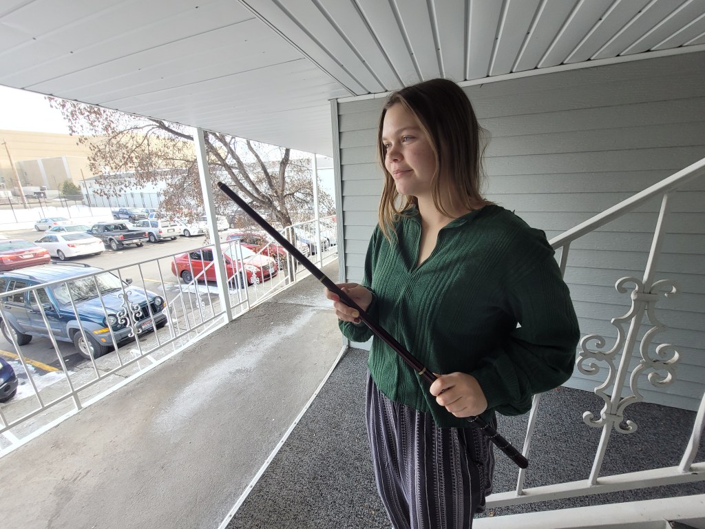


With these that I took I think the subject would be able to replace the one in the magazine based on how each person is facing. works for the first and last one, but the second is more centered then on the line of thirds. I also applied shallow depth of field to each that I think represents the magazine spread.
Conclusion:
In conclusion the following principles rule of thirds, depth of field, leading lines, and typography all come together to unify a picture or design. For photography I learned that rule of thirds help focus on the subject of the photo. By splitting the image into thirds and placing the subject on those lines we get a picture that is pleasing to the eye. With leading lines it creates a path for the eyes to focus on the subject. Depth of field can be used as either blurring the background or keeping it clear. This principle can help focus on one part of the photo or allow the entire scenery to be used. Let’s not forget typography as well which is the finishing touch to any Design. The type fonts to use are Old Style, Modern, Slab serif, Sans Serif, Decorative, and Script.

Leave a comment