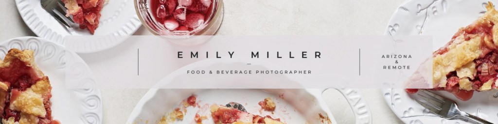
Emily Miller-photos
Proximity
https://www.linkedin.com/in/emily-miller-photos
In this picture you can see an example of proximity where she had her name and job title grouped together. On the right side the words are also grouped together. If I was to give any advice I would write something on the far left like her website or social media tags. The layout looks a little unbalanced and I feel adding something would help with that.
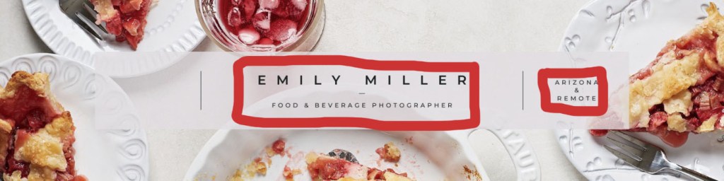
Alignment
With the alignment of the design she centered everything. With the words in the middle she made the bottom set have a different center which was what the book suggested. I the think the alignment looks good and having her name in bigger letters helps it draw your eye.
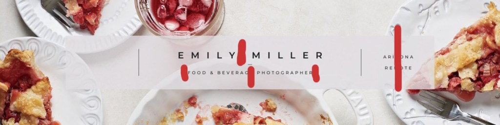
Repetition
I saw a lot of repetition with the color in food being red and the font style she used in her design.
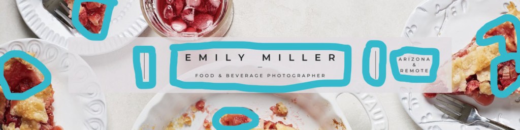
Contrast
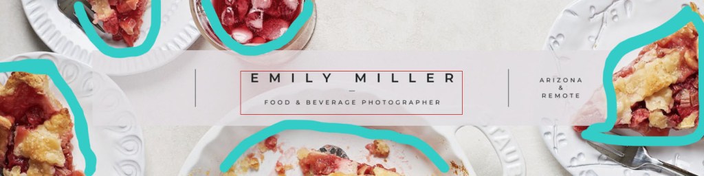
A big contrast is the food and it’s color. She used a white background with plates that makes the food and words stand out. This is nice because then it’s clear what the message is and there isn’t too much color that it overwhelms the eyes. If I were to change one thing I would add a little more color because it still seems a little too simple.

Leave a comment